The Problem with Inconsistent Product Images
When shopping for wall art online, you're making a decision based entirely on images. You can't see the print in person, hold it up against your wall, or compare two options side by side in your living room.
Many art sellers show each print in a completely different setting. One poster is in a minimalist Scandinavian room. Another is in a rustic farmhouse kitchen. A third is floating against a plain white background.
This makes it nearly impossible to compare. You're not just comparing the artwork, you're comparing completely different photography styles, lighting conditions, and room aesthetics.
Our Approach: Consistency First
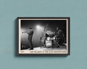
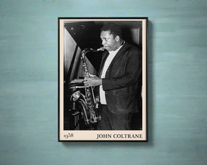
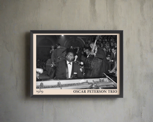
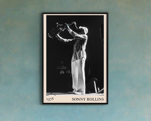
At Dalston 606, we use the same realistic mockup templates across our entire collection. When you're browsing our jazz prints, you'll see them displayed in identical settings:
- The same frame styles
- The same room environments
- The same lighting
- The same wall colours
This means when you're deciding between our Miles Davis print and our John Coltrane print, you're comparing the artwork, not the staging.
How It Helps You
True comparison shopping - Fancy both our Thelonious Monk portrait and our Blue Note typography print? When they're shown in the same frame on the same wall, you can genuinely compare how each would look in your space.
Accurate size representation - We show prints at A3, A2, and A1 in consistent room settings. You can see exactly how much wall space each size fills, helping you choose the right dimensions for your room.
Frame visualisation - Our framed options are shown in the same frame style throughout. No guessing whether the black frame on one product is the same as the black frame on another, it is.
Colour accuracy - Same lighting across all mockups means the colours you see are consistent. A warm sepia tone in one image is the same warm sepia tone in another.
The Tools Behind the Scenes
We use a tool called TakeFivve to generate our product mockups. It lets us create realistic room settings and apply them consistently across our entire catalogue.
When we add a new print to the collection, we can instantly generate mockups in all our standard templates same frames, same rooms, same presentation. The result is a cohesive shopping experience where every product image follows the same visual language.
For fellow print sellers or artists reading this, it's worth checking out if you're struggling with product image consistency. Being able to maintain the same look across hundreds of products has been a game-changer for us.
A Note on What You'll Receive
We want to be upfront: our product images are realistic mockups, not photographs of individual items. The artwork and print quality are exactly as shown, but the room settings are digital representations.
That said, we've chosen mockup templates that accurately reflect our actual frames and mounts. When your order arrives, the print, frame, and mount will match what you saw online.
If you ever want to see additional angles or have questions about how a print might look in your specific space, just get in touch. We're always happy to help.
Why This Matters
In a world where online shopping can feel like guesswork, we believe consistency builds trust. You shouldn't have to decode different photography styles just to compare two posters.
Our jazz prints deserve to be judged on their own merits the composition, the history, the emotion they capture. By keeping our product presentation consistent, we let the art speak for itself.
Now, the only hard decision is which legendary musician deserves a spot on your wall. 🎺
DALSTON 606
Enjoyed this? Take ten on us.
Get 10% off your first order of original music photography prints. New drops and stories behind the shots, straight to your inbox.